Co-designing a medication-management app with AI to help make medication routines simple, seamless, and stress-free

About
KlarityCare | Every dose, with care.
Clarity and confidence for daily medication routines.
Clarity and confidence for daily medication routines.
KlarityCare is a calm, human-centered medication-management app designed to help people stay organized and confident in their daily routines. Through clarity-first design and gentle guidance, it brings emotional ease to an area of health that often feels overwhelming.
Problem:
Managing medications is a daily challenge for individuals and caregivers who must remember doses, interpret schedules, and monitor supplies while juggling busy lives. Most tools add cognitive load through cluttered interfaces, clinical tone, or rigid reminders, leaving users feeling stressed, unsupported, and unsure.
Solution:
KlarityCare simplifies medication routines with a clear daily timeline, intuitive dose logging, low-supply alerts, and warm, supportive interactions. By reducing friction and emotional stress, it transforms medication management into a calm, confidence-building experience — every dose, with care.

• Duration: Sept 8 – Dec 8, 2025 (13 weeks)
• Role: Product designer
• Team: Solo Project
• Role: Product designer
• Team: Solo Project

THE CHALLENGE
How might we leverage AI to co-design a calm, intuitive medication-management experience that brings clarity to daily routines and reduces the stress users feel when managing medications for themselves or loved ones?

DISCOVERY
Through competitive analysis and persona development, I identified the core user needs and gaps.
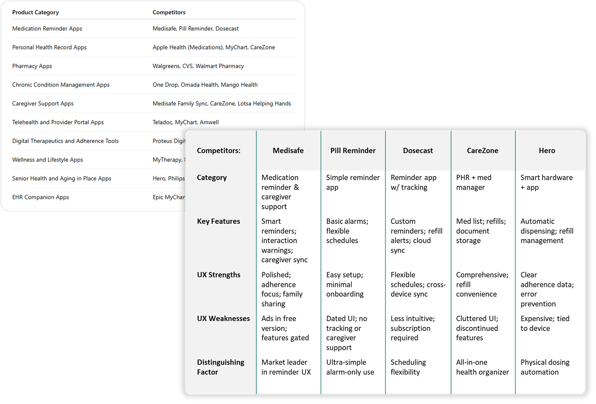
Competitive Analysis
What can we learn from the market space?
What can we learn from the market space?
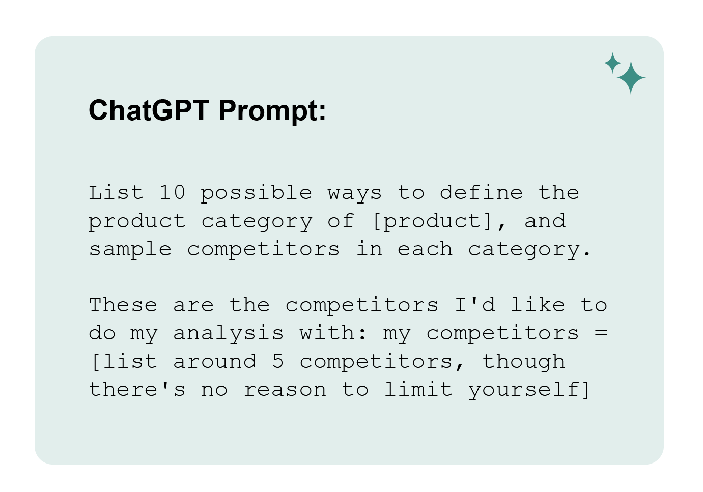
Insights:
• Competitors are cluttered, clinical, and can be hard to interpret.
• Medication setup and scheduling are confusing.
• Medication-taking history and data lacks clear, simple visuals.
• Caregiver-focused features and support are limited.
• None address the emotional stress around medication.
Takeaway:
ChatGPT significantly accelerated the competitor analysis and made it easy to compare many apps at once. However, its evaluations are inherently shallow because it cannot actually use the products. Its insights rely on public information and recognizable patterns rather than firsthand interaction. This still provides valuable high-level perspective, but it’s important to acknowledge that AI may miss nuanced usability elements—such as microinteractions, friction points, emotional responses, and accessibility barriers—that may only emerge through real product use and user testing.
Overall, the analysis emphasized opportunities for simplicity, emotional reassurance, and accessibility.
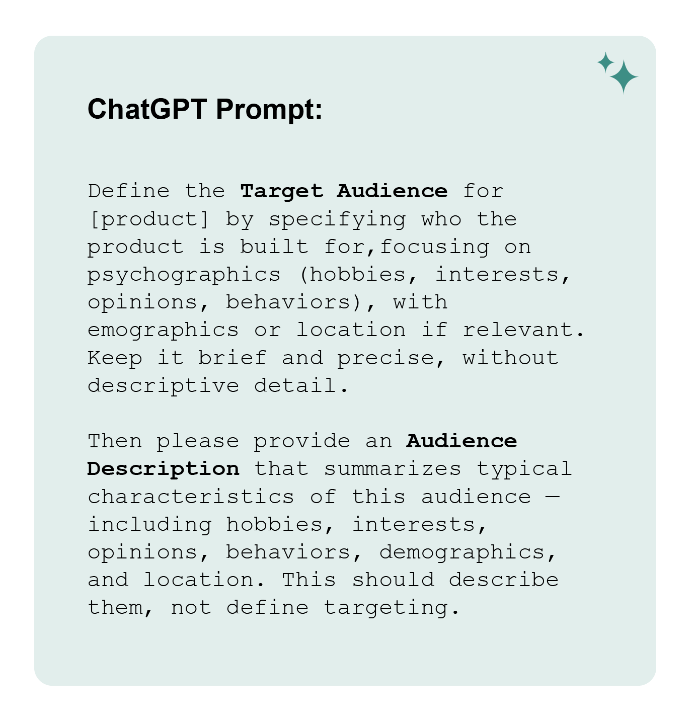
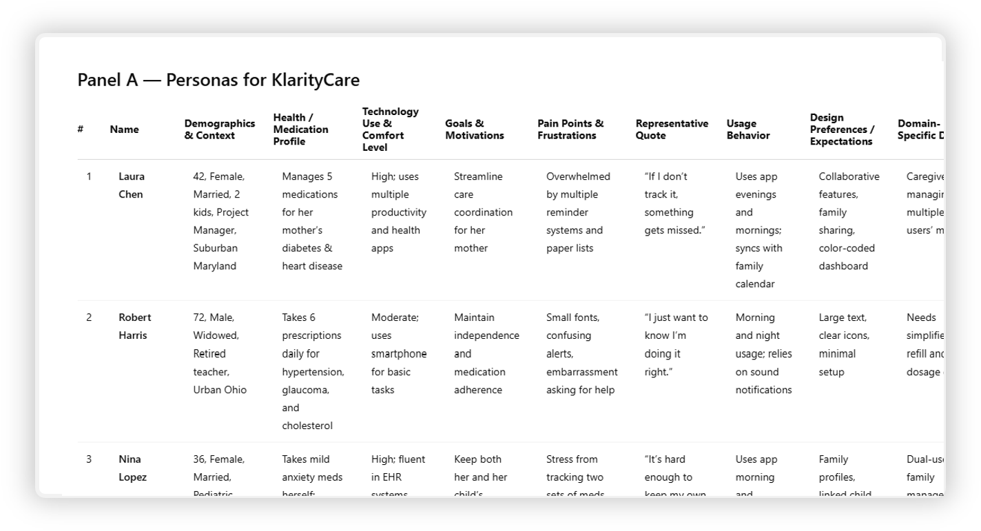
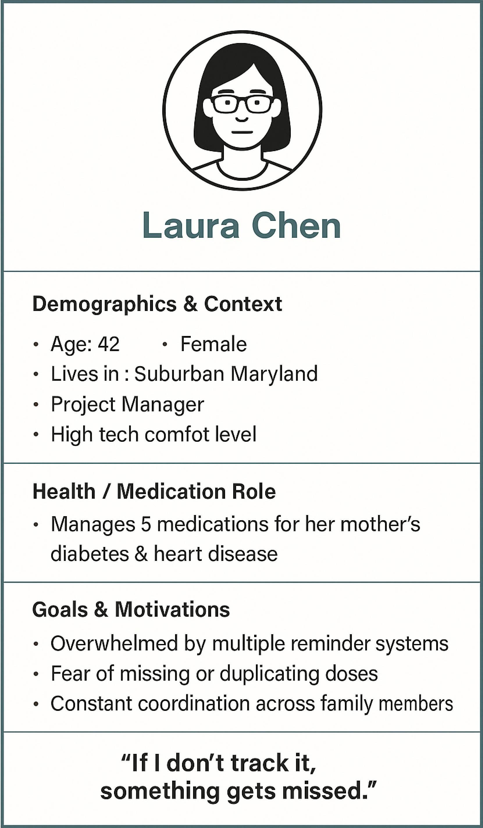
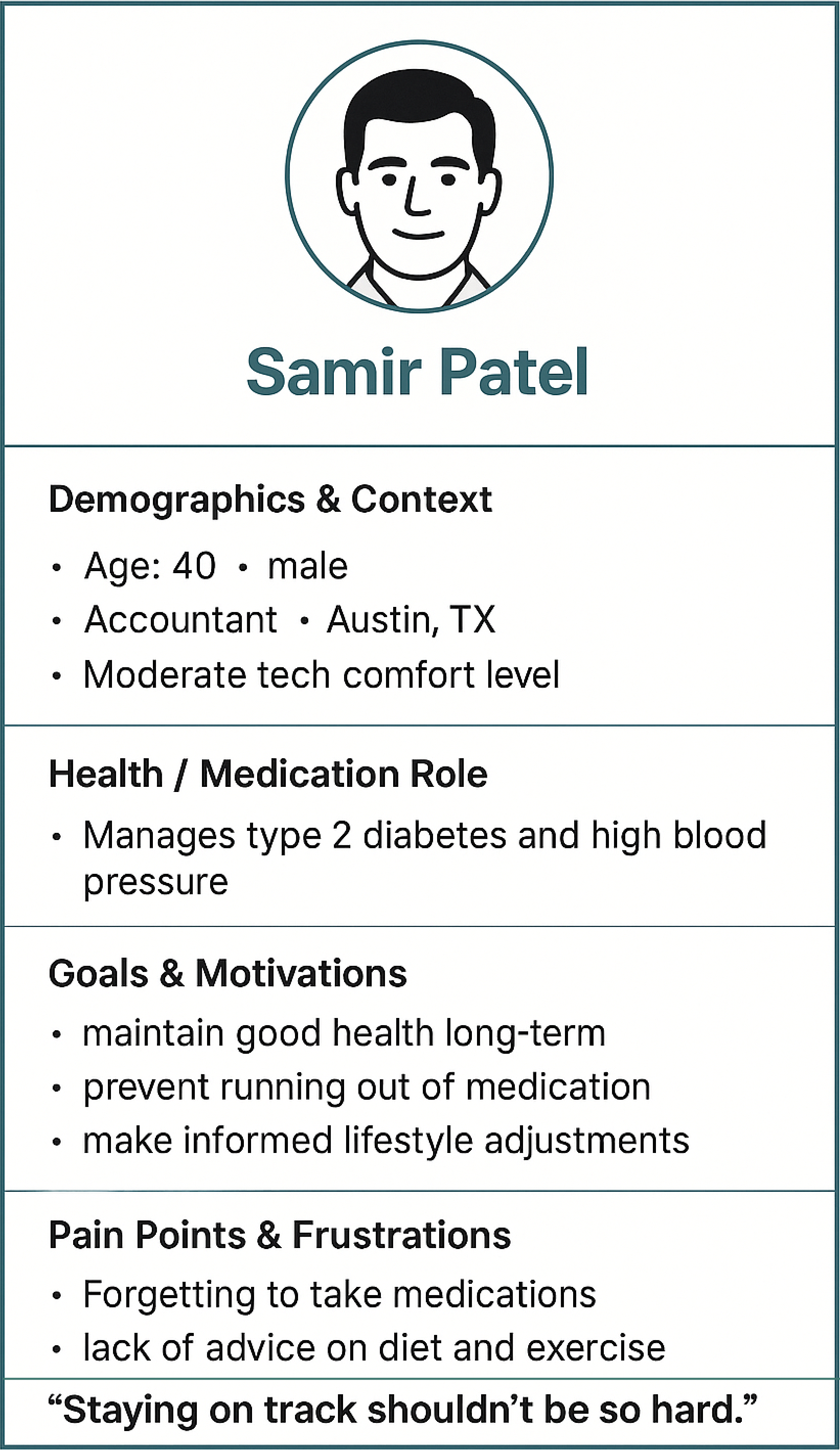
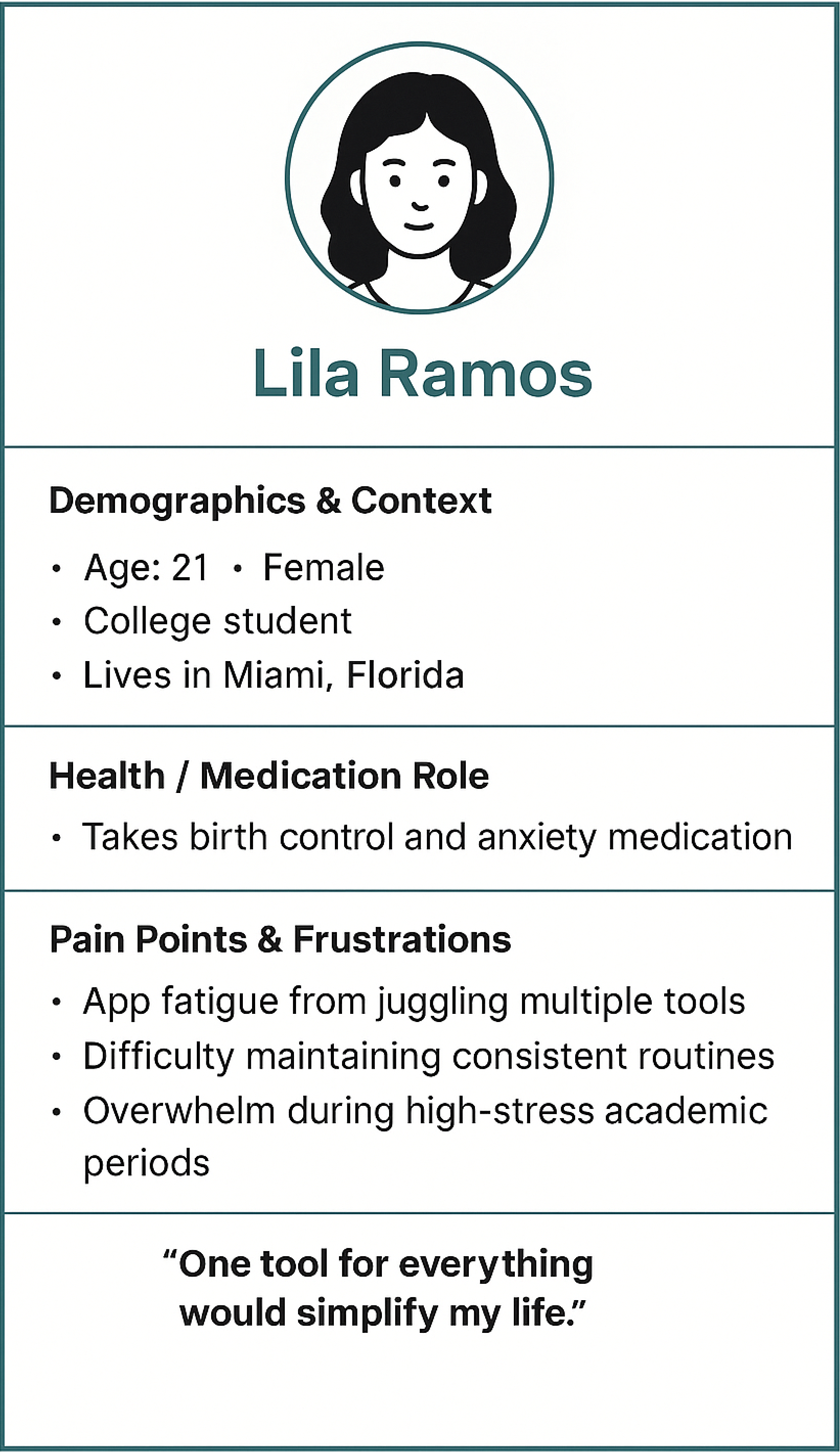
Personas
Who are we designing for?
Who are we designing for?
Insights
• Users manage daily meds and rely on digital tools.
• They value structure, reminders, and reduced mental load.
• Caregivers coordinating meds are a major segment.
• They already use calendars, trackers, and wellness apps.
• They want simple, reliable, low-friction experiences.
• They trust reputable health info and proactive care.
Takeaways:
Through a series of prompts, I used the market analysis from above to help determine who the primary audience would be for KlarityCare. I found this preformed better with the "Web Search" feature turned on as it was able to
Through a series of prompts, I used the market analysis from above to help determine who the primary audience would be for KlarityCare. I found this preformed better with the "Web Search" feature turned on as it was able to
Takeaways:
I ran through several iteration with the personas panel as I was unhappy with the original output's lack of diversity in gender, age and ethnicity. The initial result produces a panel of personas that were mostly white, elderly men, so I ran through several additional iterations to widen and diversify the persona pool while staying true to the market space and audience. I then struggled to have ChatGPT draw my chosen 3 personas. it was a slow painful process that I would not repeat using ChatGPT.
I ended with three archetypes:
• Caregiver / Coordinator – Manages meds for others; needs clarity and shared control.
• Self-Manager – Handles their own meds; wants consistency and autonomy.
• Lifestyle User – Blends meds with wellness goals; seeks motivation and insight.

DEFINE
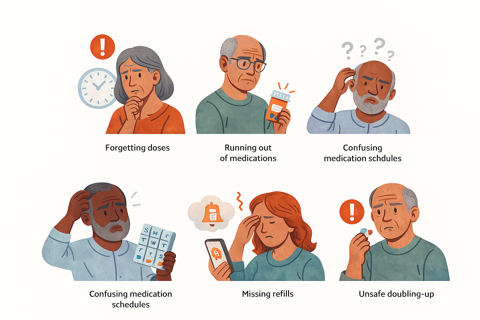
Pain Points
The main issues that arose
The main issues that arose
Takeaways:
• ChatGPT struggles to follow direction with image generation
• Lacking diversity in illustrations as most are elderly men.
• Illustration style is good, but repeats and errors make it unusable.
In addition the having ChatGPT illustrate the top pain points and users' experiences I also conducted a thorough multi-step process that used interaction design best practices to draft wireframes and key screens through the below 8 steps. I went step by step reviewing and providing feedback on each only continuing to the next step once I was happy with the iterated output. See some of these prompts and outputs in the next sections.
1. Identify User Pain Points and Mental Models
2. Develop Design Patterns
3. Create a Task Inventory with Reference to Design Patterns
4. Task Decomposition and Swim Lane Table with Design Patterns
5. Optimize Tasks
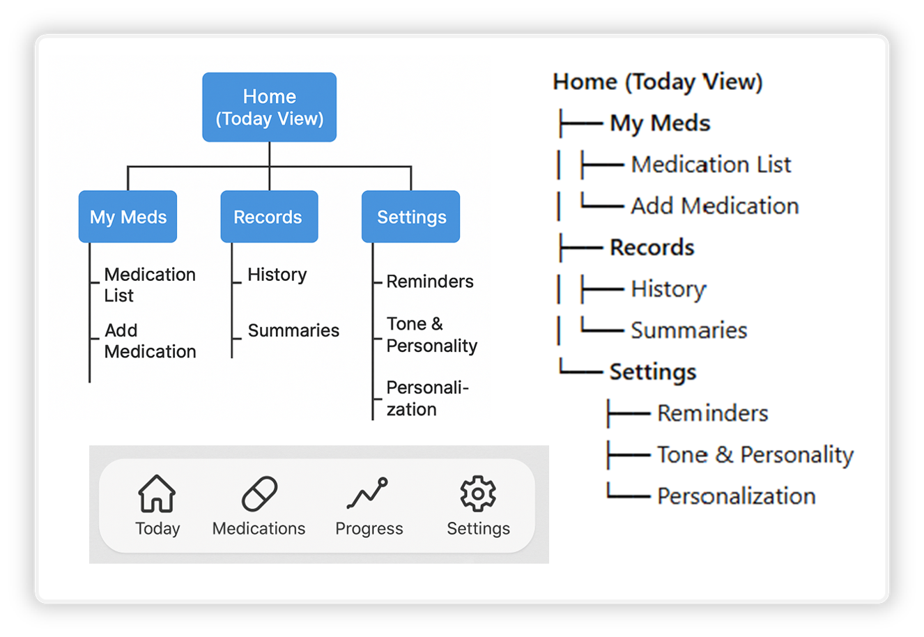
6. Design the Information Architecture (IA) and Navigation
7. Create a Content Inventory
8. Key Screens for Wireframing
Key Design Opportunities
What do KlarityCare users really need?
What do KlarityCare users really need?
• Clarify medication routines with a simple, glanceable daily timeline.
• Reduce emotional stress through calm visuals, gentle reminders, and supportive tone.
• Lighten cognitive load using clear dose setup, intuitive flows, and predictable interactions.
• Support caregivers with tools that simplify coordinating meds for others.
• Prevent last-minute issues through smart alerts like low-supply notifications and missed-dose nudges.
User Flow
How user's interact with the app?
How user's interact with the app?
Takeaways:
• ChatGPT provided a solid starting point but not the final layout for KlarityCare's IA.
• The navigation bar and sitemap were useful as they provided a visual foundation for me to start designing. I did, however, have to do several iterations to get the labeling and structure I felt was best.

ideate
Wireframe Analysis
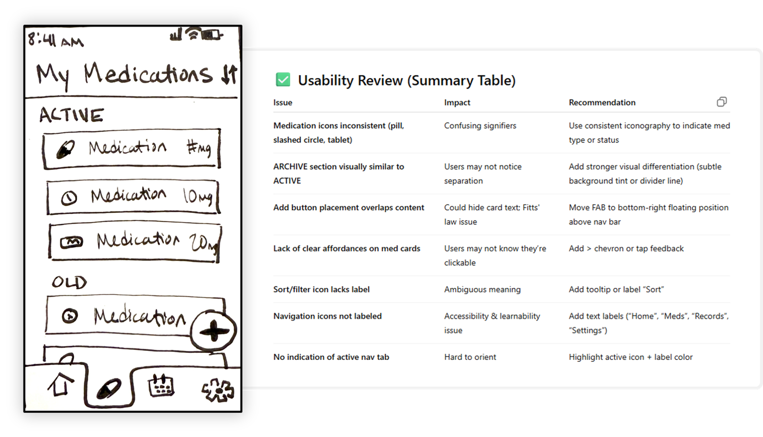
With the IA and navigation generated above I sketched out several lo-fi wireframes and uploaded them to ChatGPT where it inventoried the UI components and ran a usability review on the UI. You can see my wireframe and usability review for "My Medications" screen below
Takeaways:
• Often misinterpreted my icons and UI elements.
• ChatGPT does not apply context in its analysis.
• Could be useful in handing off design specs later on.
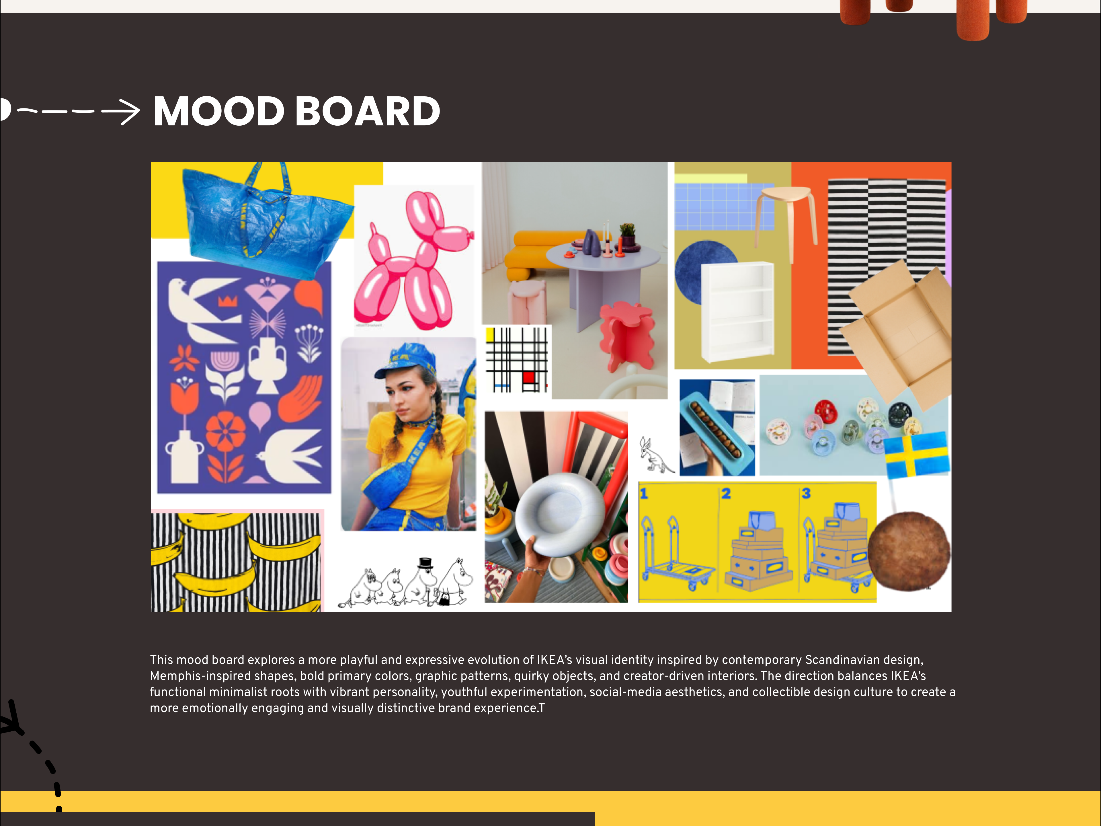
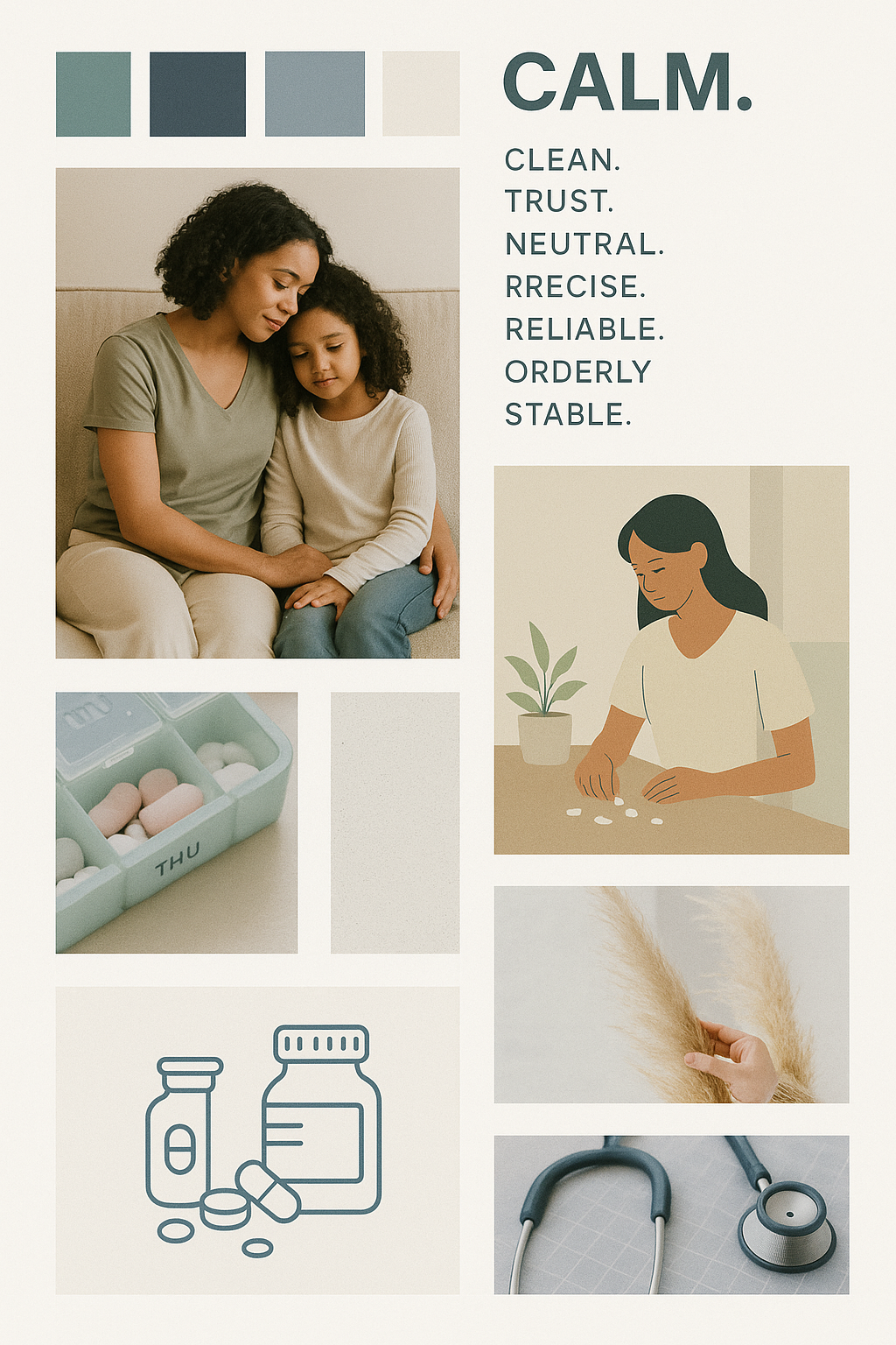
Mood boards
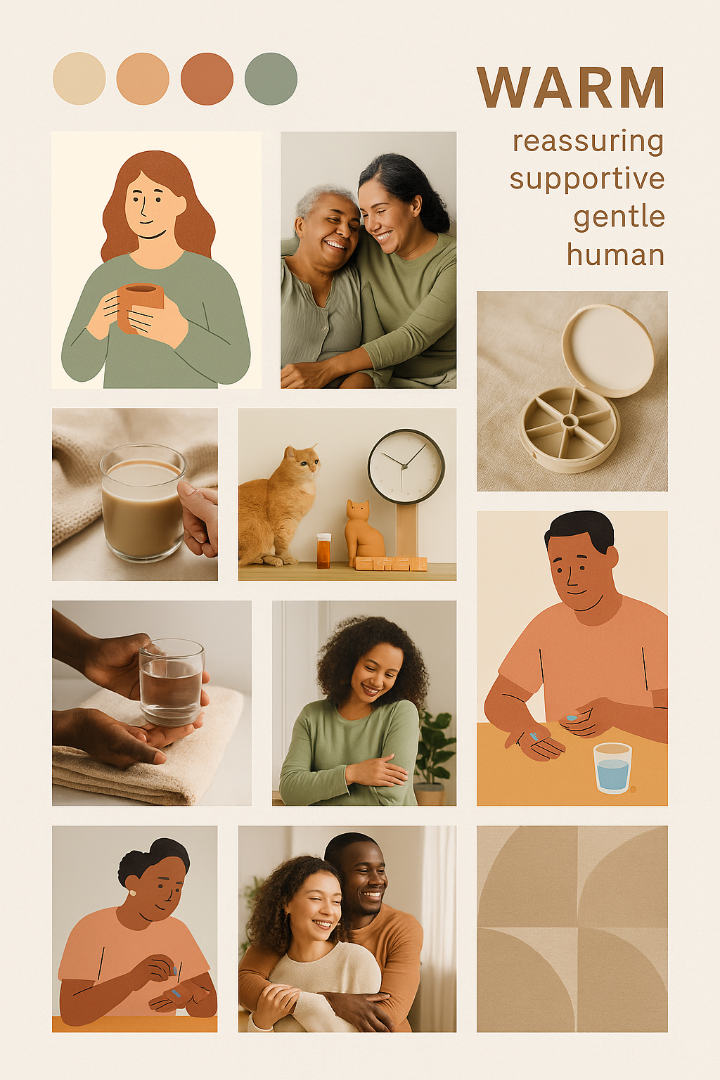
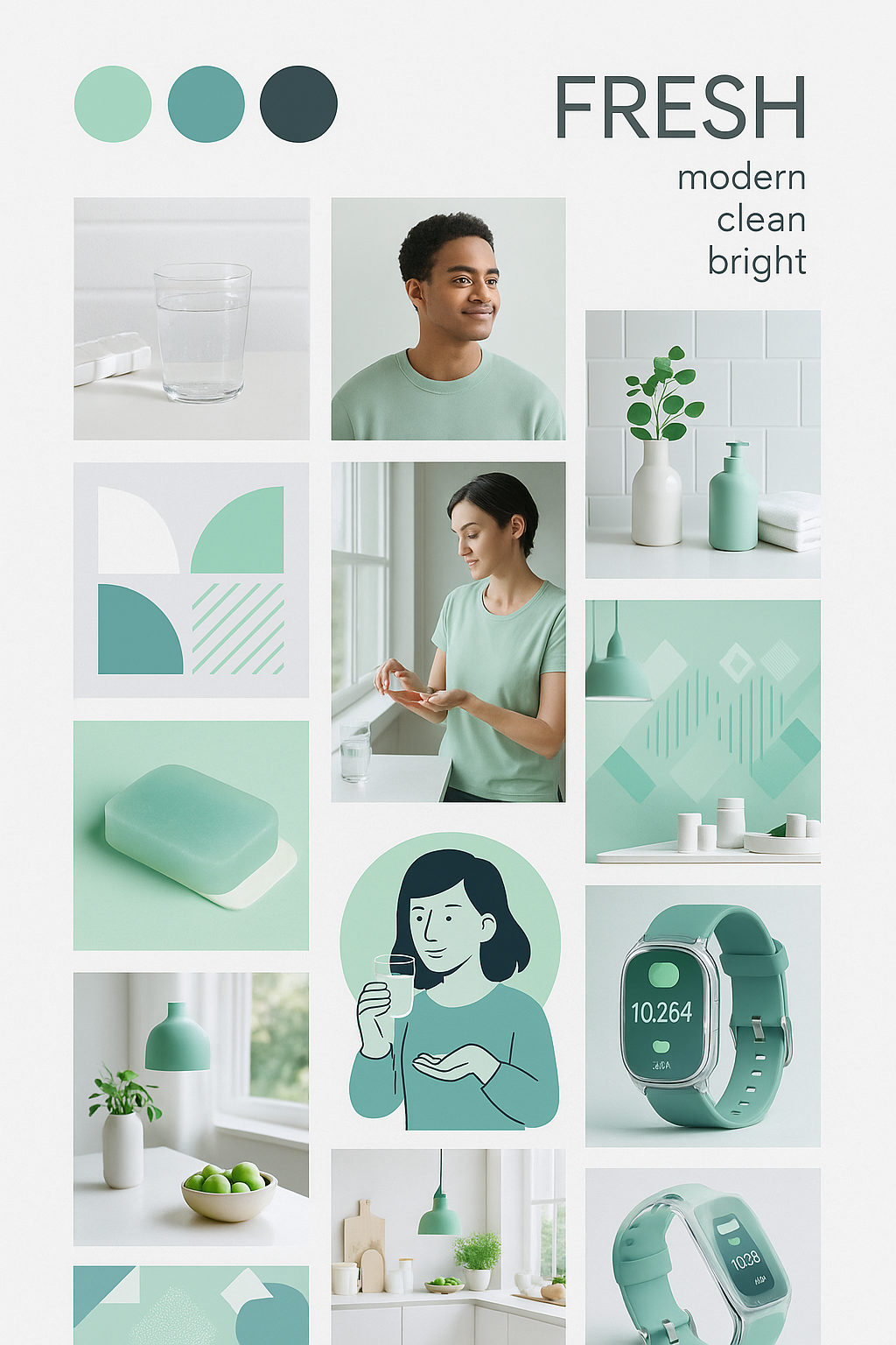
Takeaways:
• Had to re-prompt to "please use image generation!" to get actual images.
• Had to re-prompt to "please use image generation!" to get actual images.
• The three mood boards above were generated by ChatGPT after several frustrating iteration.
• It helped conceptualize the brands but would not use for final client facing assets.
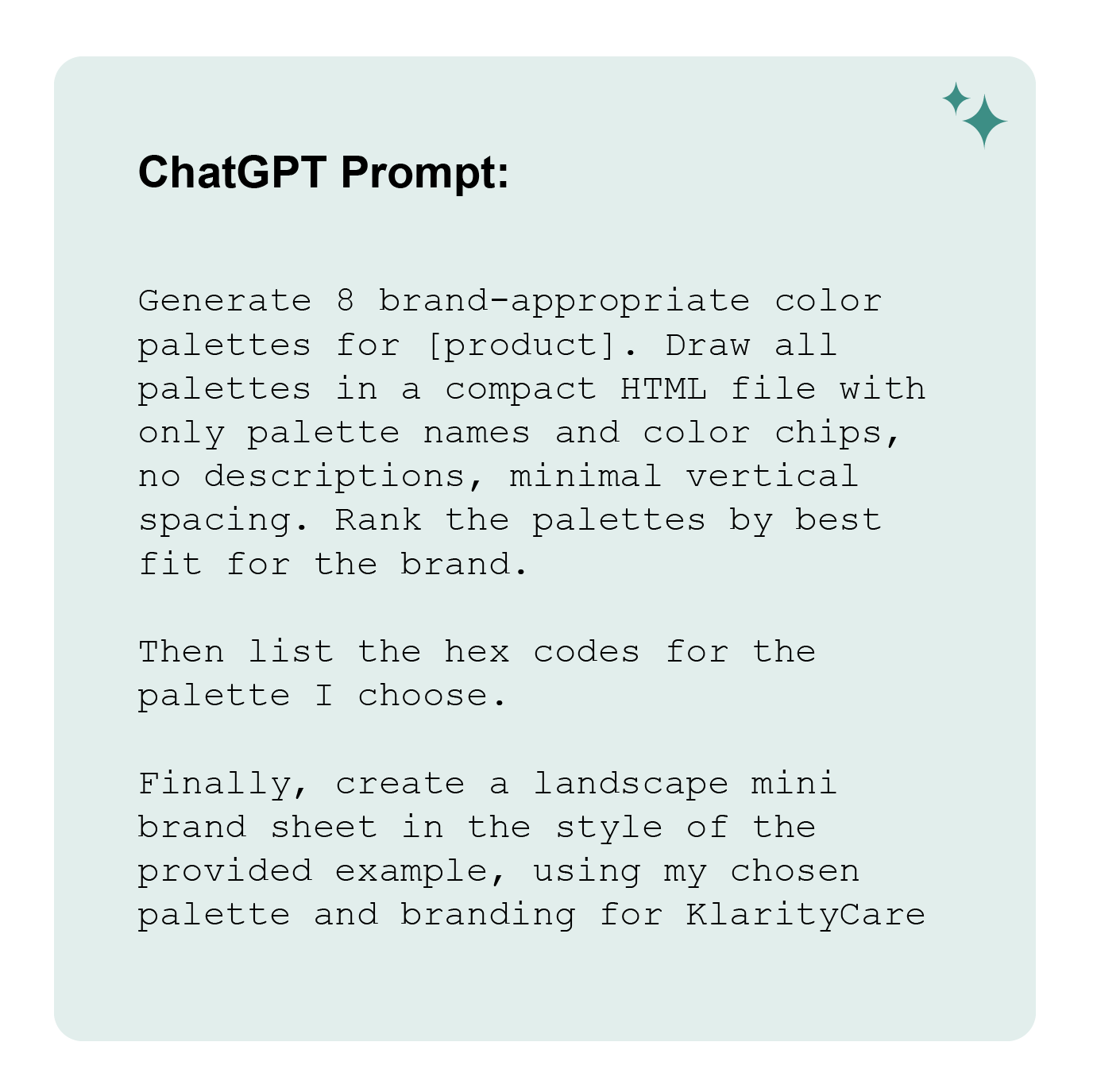
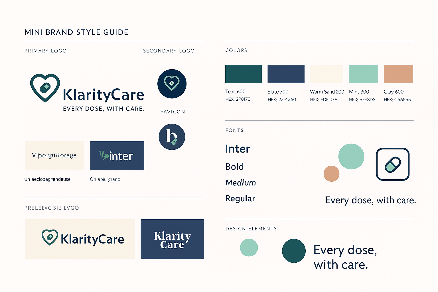
Brand Identity
Takeaways:
• ChatGPT was helpful in the rapid generation of multiple color pallets.
• ChatGPT was helpful in the rapid generation of multiple color pallets.
• I will use this technique again to help visualize different options quickly.
• Ideating on additional branding (name, font and icons) took a long time.
• I then pulled everything into a mini brand style guide.
• All generated content and images need close human review and evaluation for errors.
• I find graphic asset output is not the best use for ChatGPT, as you end up having to make more edits.

ITERATION
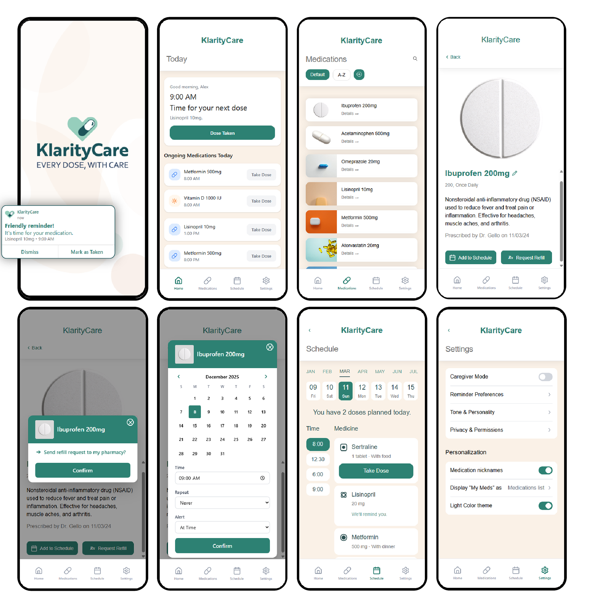
Simulated Interface
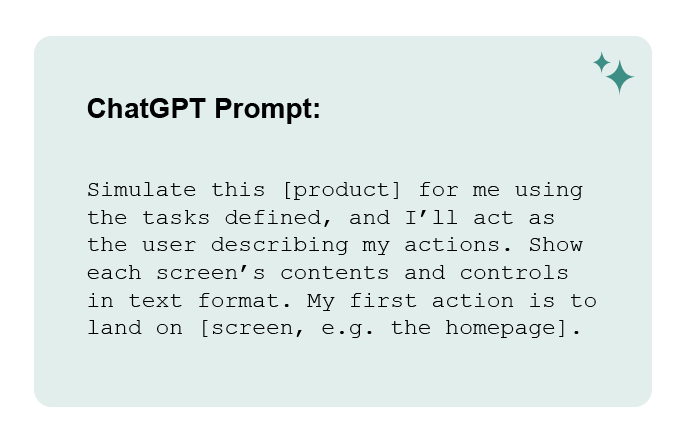
See the video below for a glimpse of what it looks like to run through a few interactions in ChatGPT's simulation of KlarityCare.
Takeaways:
• The simulation allowed rapid task flow testing.
• Refined IA and preparing for higher-fidelity designs.
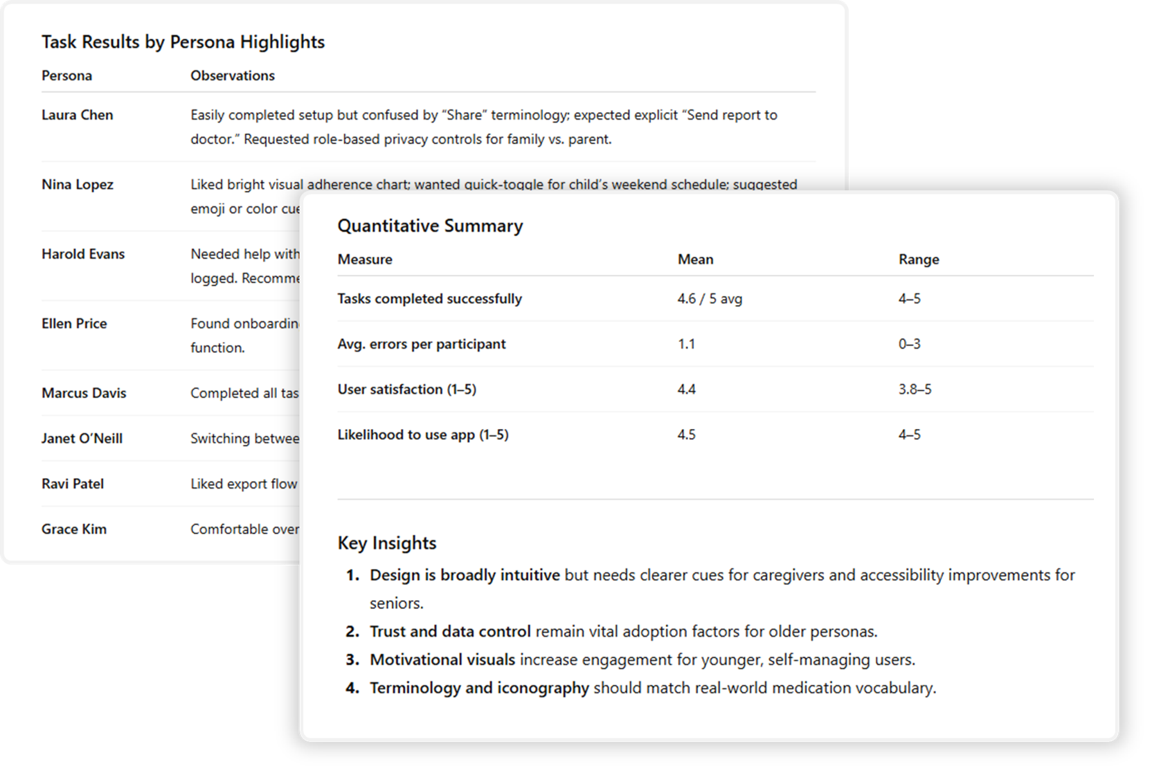
Simulated User Testing
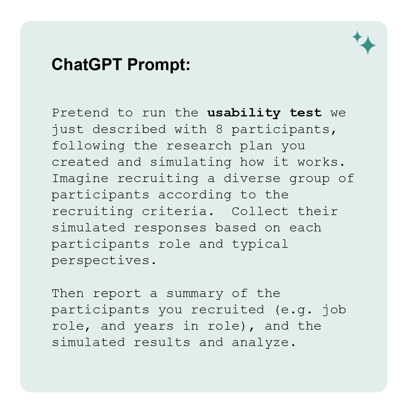
Takeaways:
• Fast way to simulate feedback and spot edge cases.
• Allowed testing on personas.
• Too agreeable — lacks real user tension.
• Can give false confidence without real validation.
The images below show the personas ChatGPT used to simulate user testing, along with the resulting summary and insights. The prompt for this test was highly detailed — requiring extensive context and setup — and too long to include in full here.”
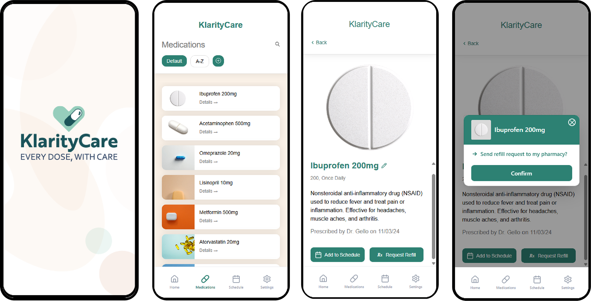
Final Design

future insights
Future versions of KlarityCare would include:
• Additional AI features to scan medications and help users understand the associated documentation.
• An option to export and share your records with providers or pharmacists in real-time.
• Seamless (UI-free) environment design or ambient design so the app can react to your environment.

REFLECTION
Co-designing with ChatGPT...
was both powerful and humbling. It helped me explore ideas faster and see problems I might have missed, yet it also showed me how easily scope can drift and how AI often defaults to optimism or over-agreement. I had to redirect it frequently, challenge its assumptions, and reinforce boundaries. This experience taught me that AI is most valuable not when it replaces human thinking, but when it expands it; provided I stay grounded in ethical awareness, clear documentation, and careful verification. This process reminded me that clarity comes from design decision not AI outputs.

Please note that this project was developed for the HCIM course, Generative AI in UX: Transforming UX Practices in the Fall 2025 at the University of Maryland, with guidance and support from Professor Tom Brinck.